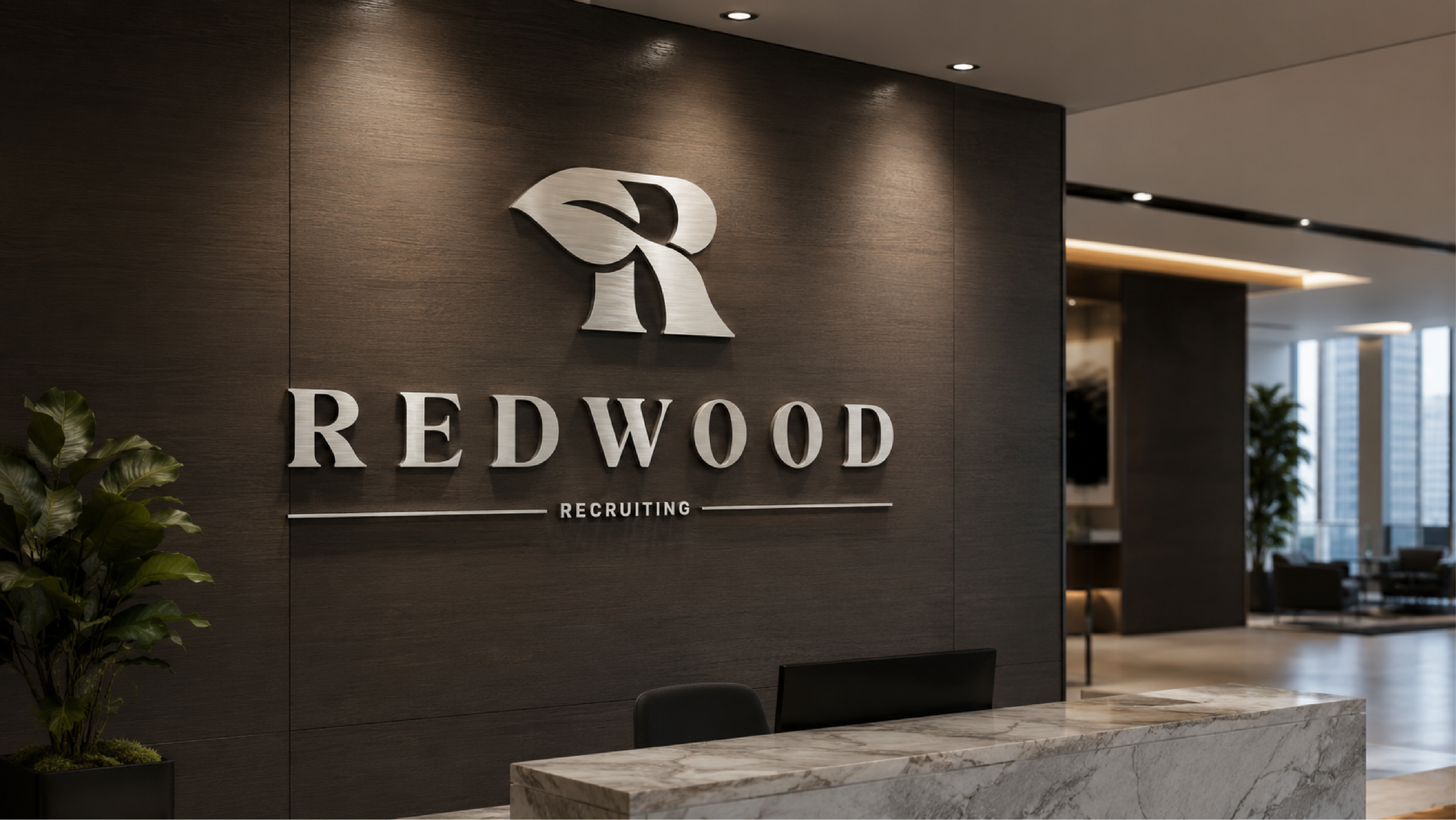
Redwood Recruiting had a national reputation but a visual identity that didn't communicate it. As one of the country's leading firms for oil, energy, engineering, and executive placements, they were operating in rooms where first impressions cost real money — and their brand wasn't keeping up.
The brief was clear: build something that reads as peer-level to the Fortune 500 companies they serve. No clip art. No generic handshake imagery. A brand that speaks the language of precision, longevity, and trust.
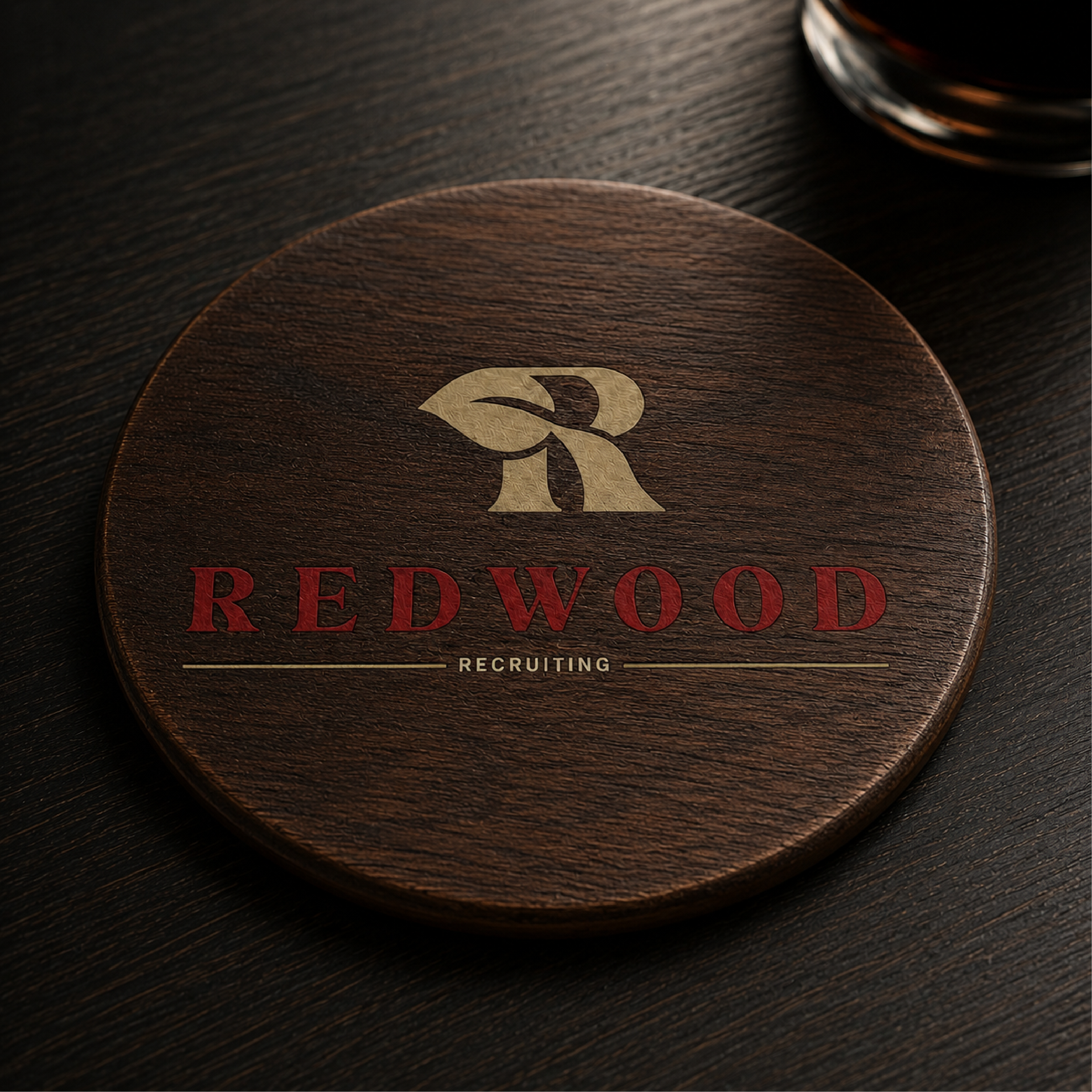
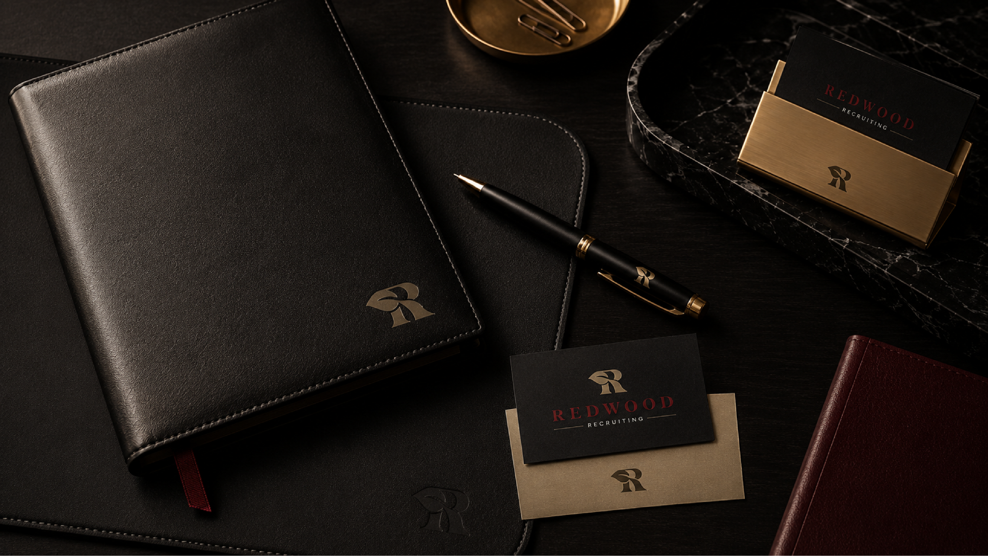
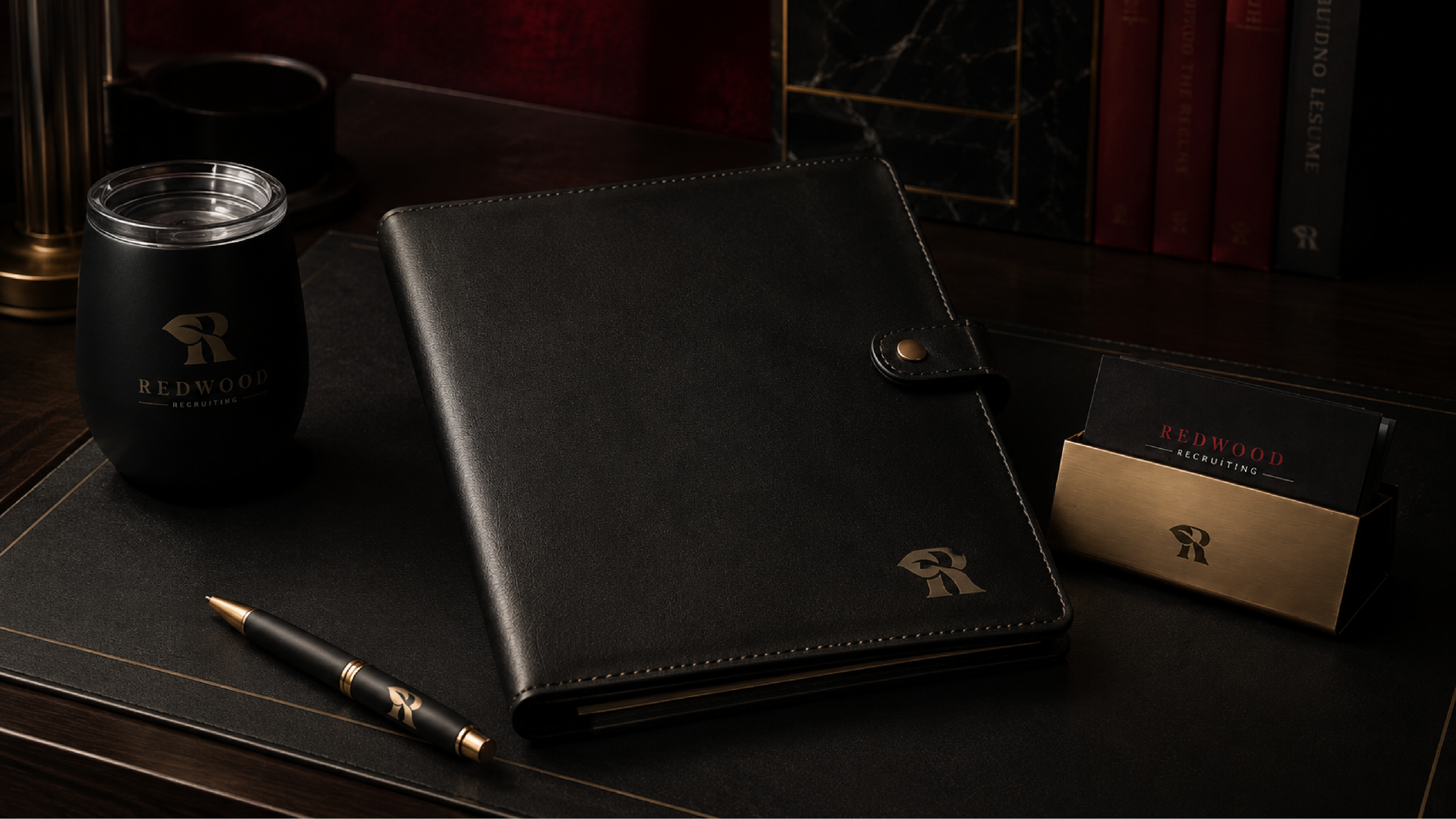
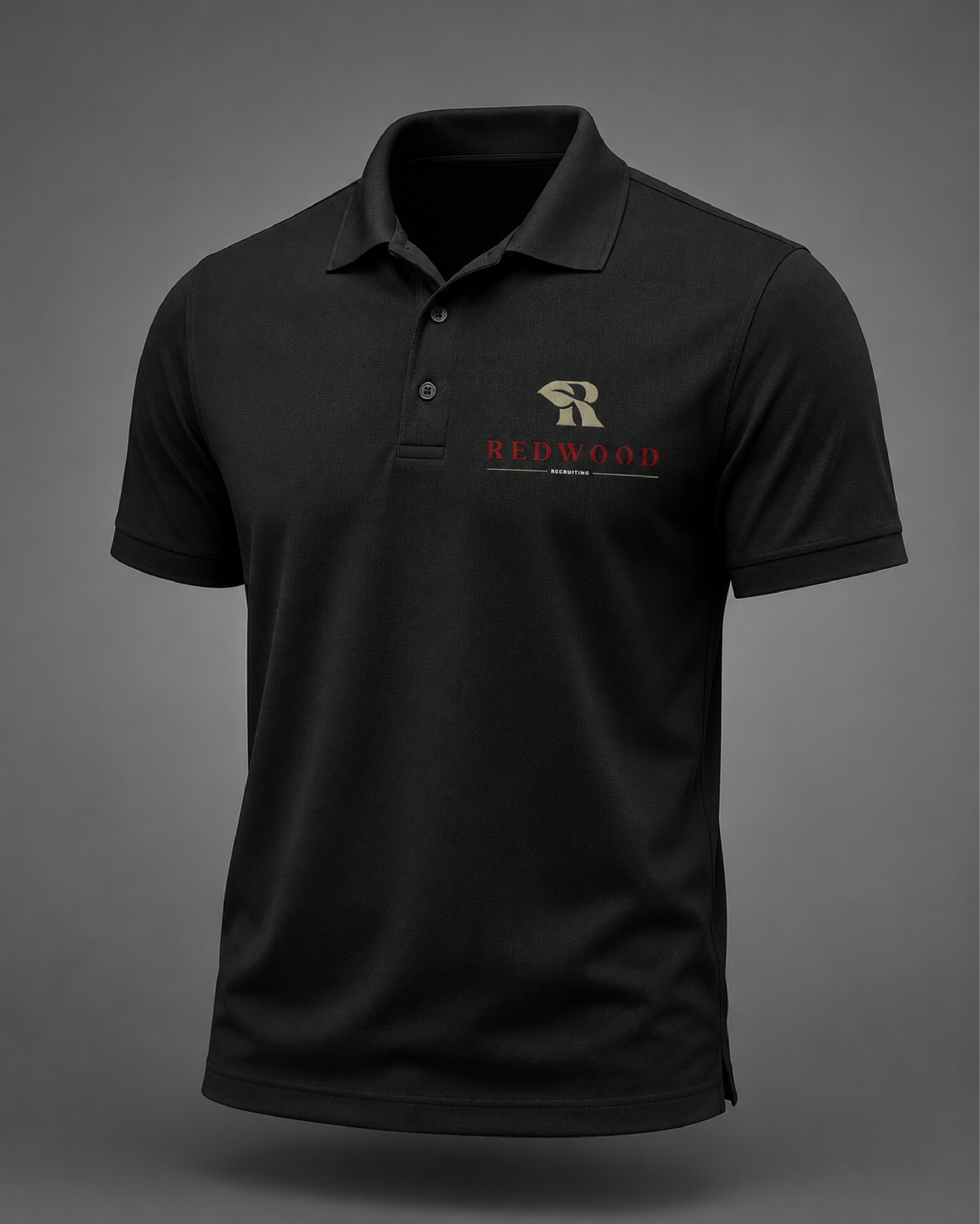
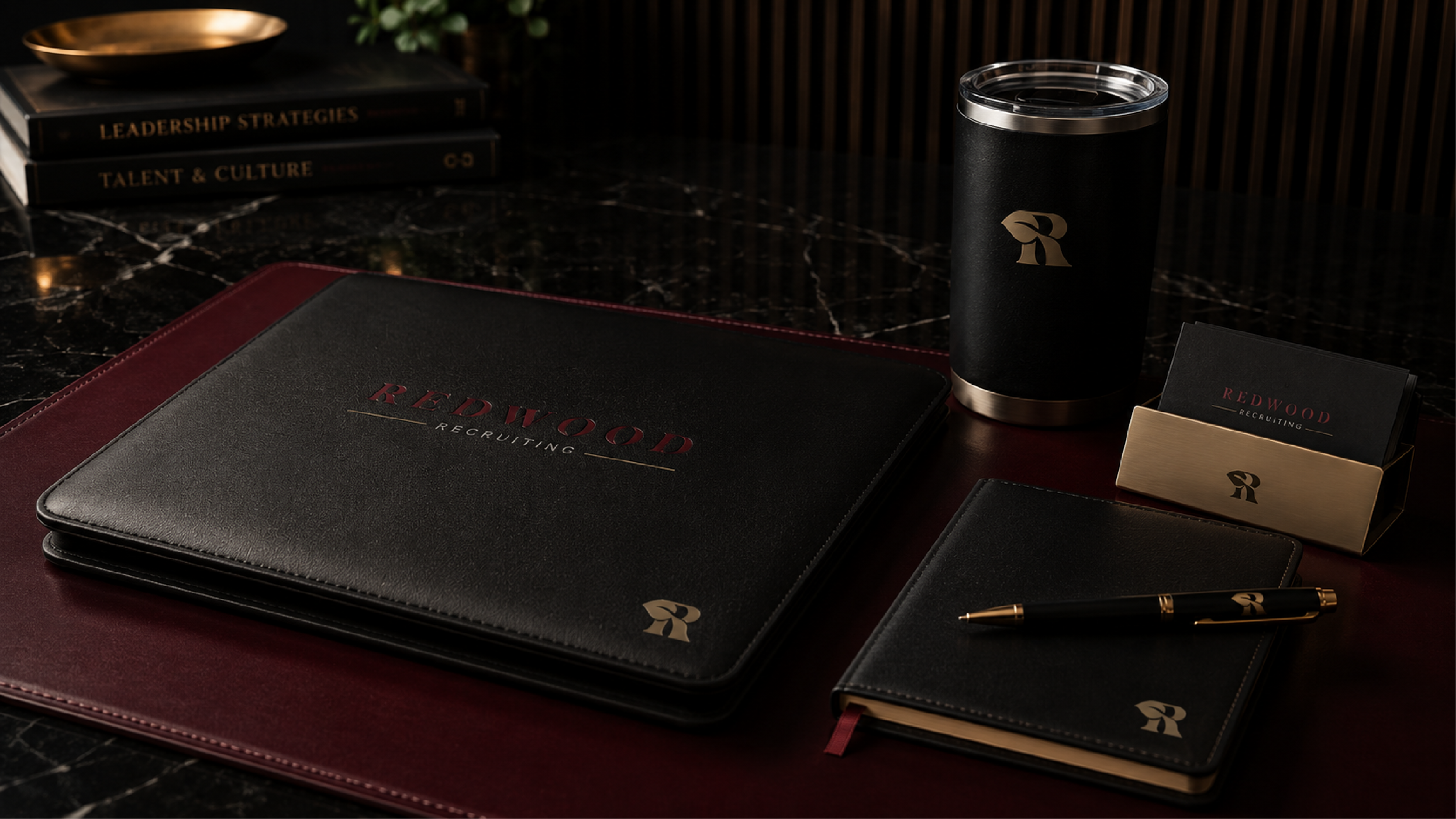
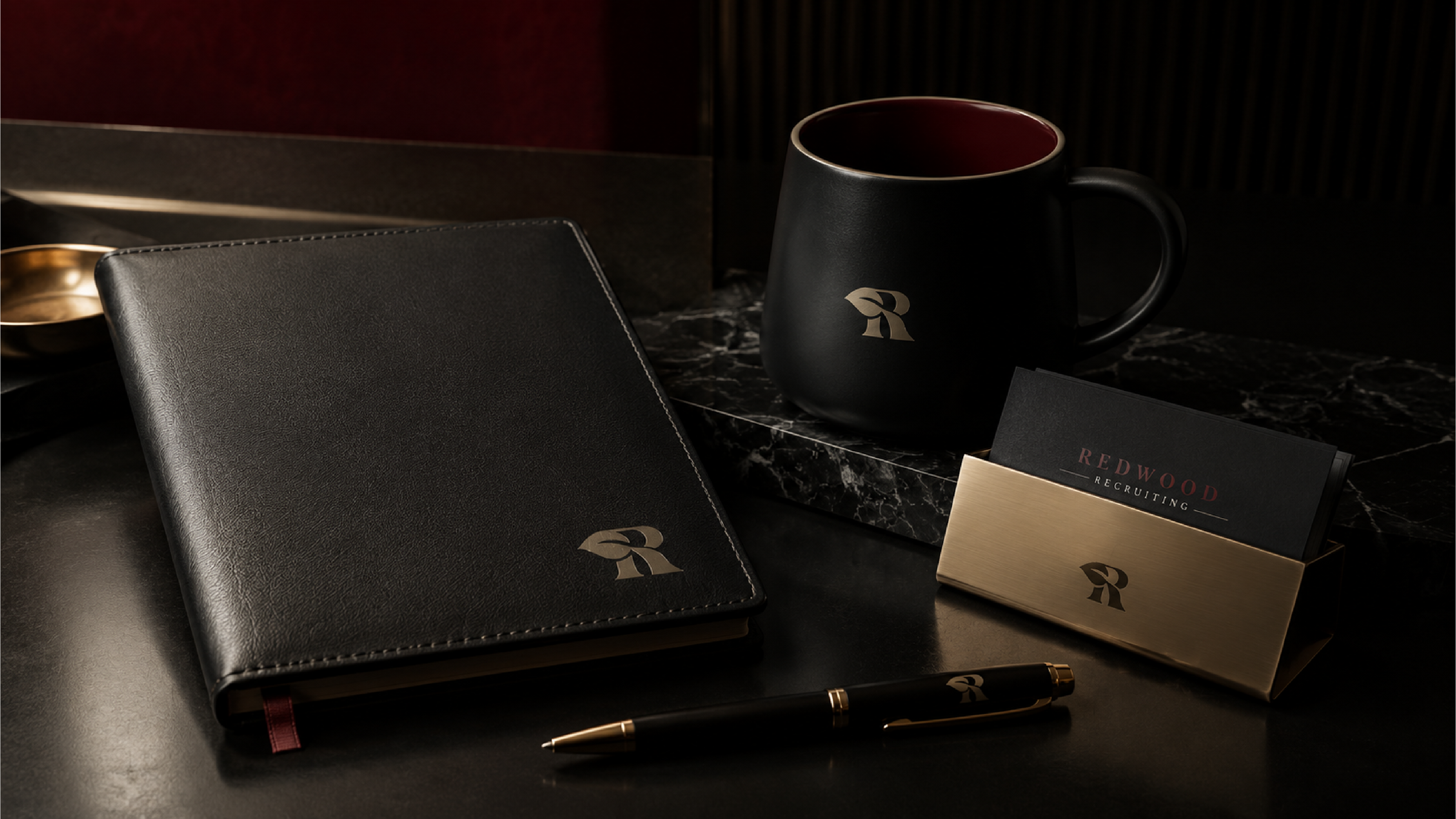
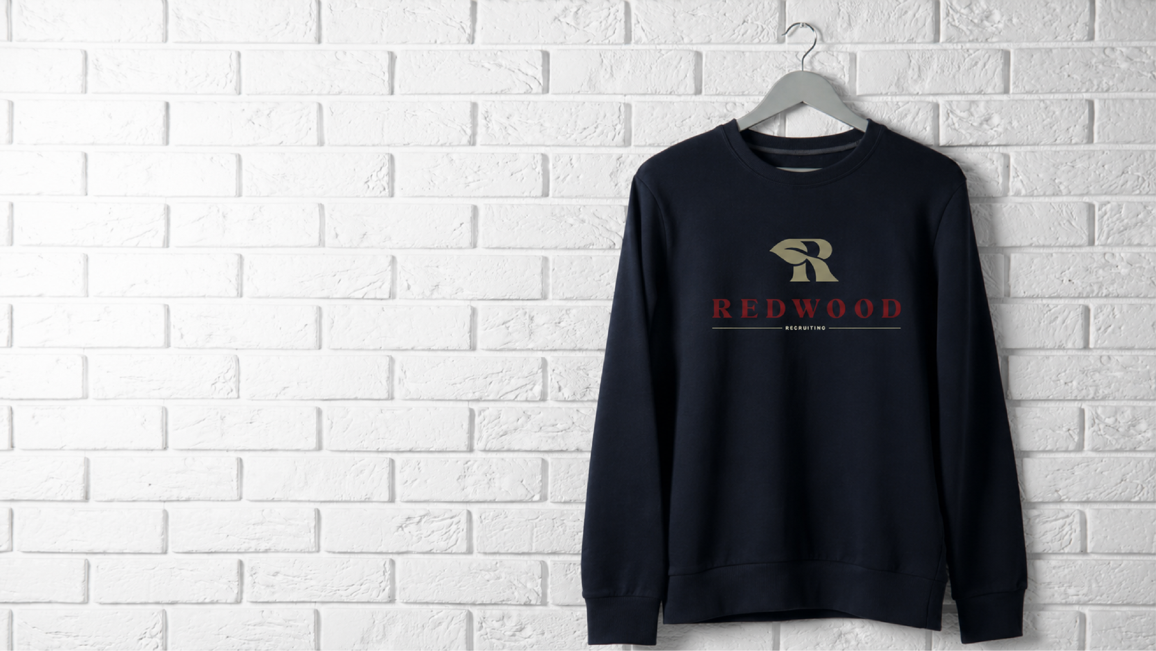
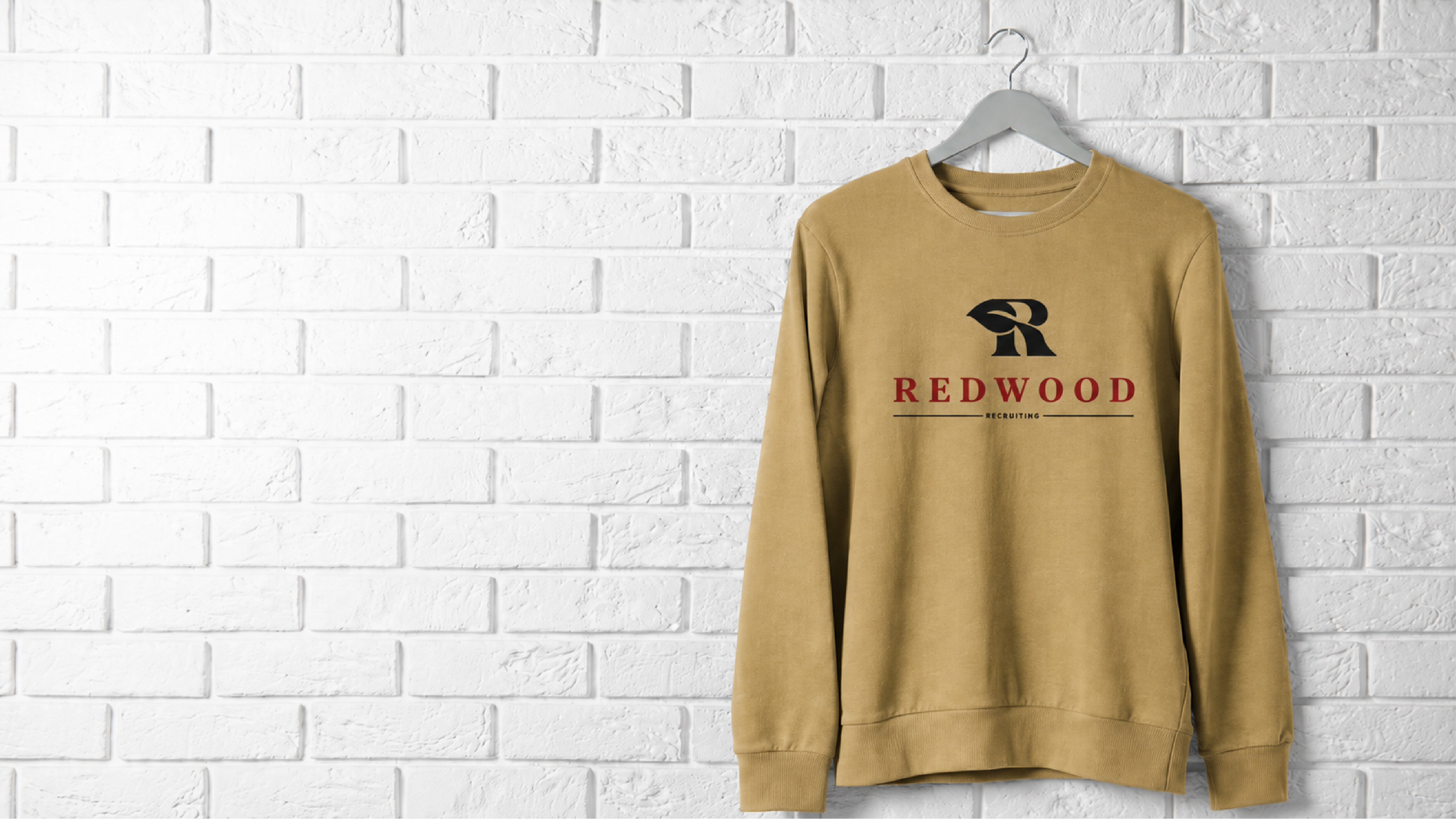
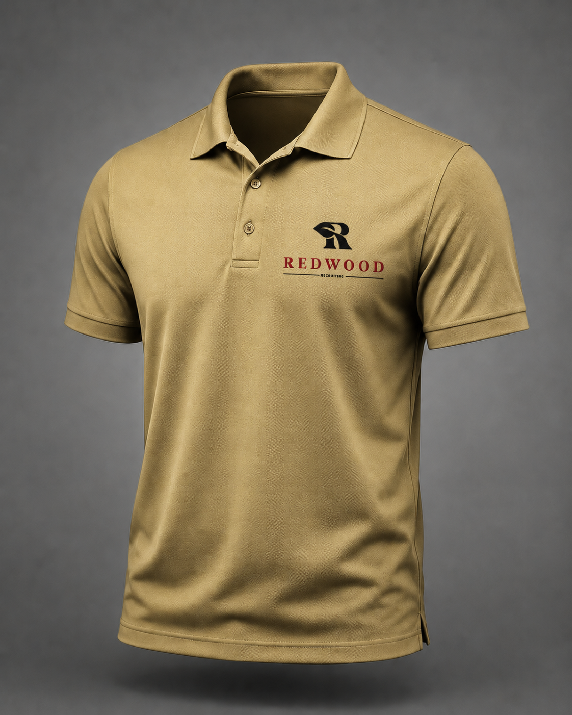
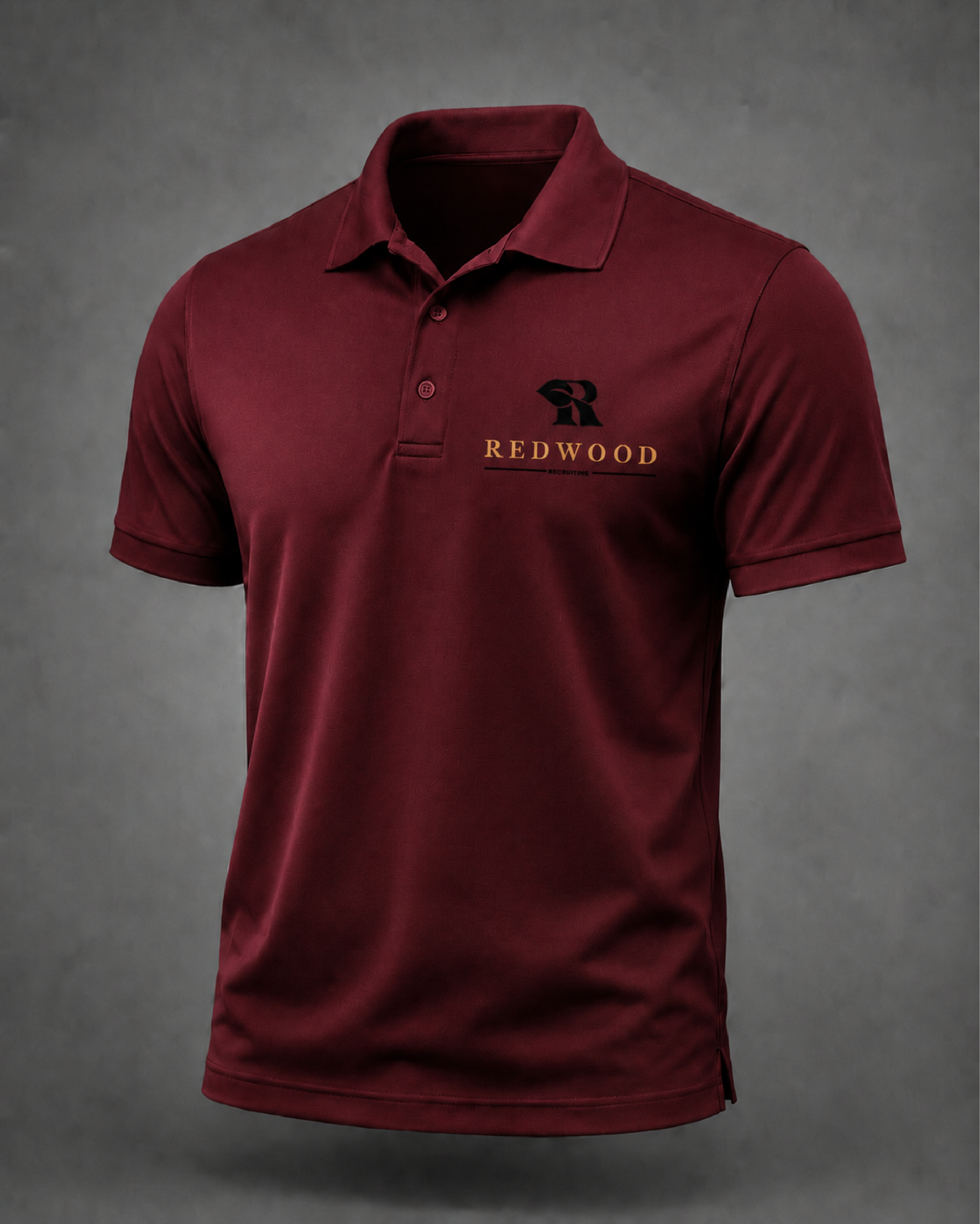
We drew on the symbolism of the redwood itself — deeply rooted, slow-grown, built to outlast — to anchor a visual system that signals permanence over trend. The forest-green and brass palette communicates old-money confidence without old-world stiffness.
"Our clients are CEOs and board members. Our brand needed to look like it belonged in the same boardroom."