Case Study — 2025

Merrilee
Wine
House

Building a first-of-its-kind art-driven identity for Houston's premier orange wine destination — where every bottle is a collector's canvas.

Brand Strategy Visual Identity Packaging Design Art Direction
Merrilee Wine House — bottle on dining table at dusk
01
Brand Identity
Scroll
Client
Merrilee Wine House
Category
Orange Wine & Natural Wines
Scope
Full Brand Identity + Packaging
Year
2025
The Brief

A brand
worth
opening.

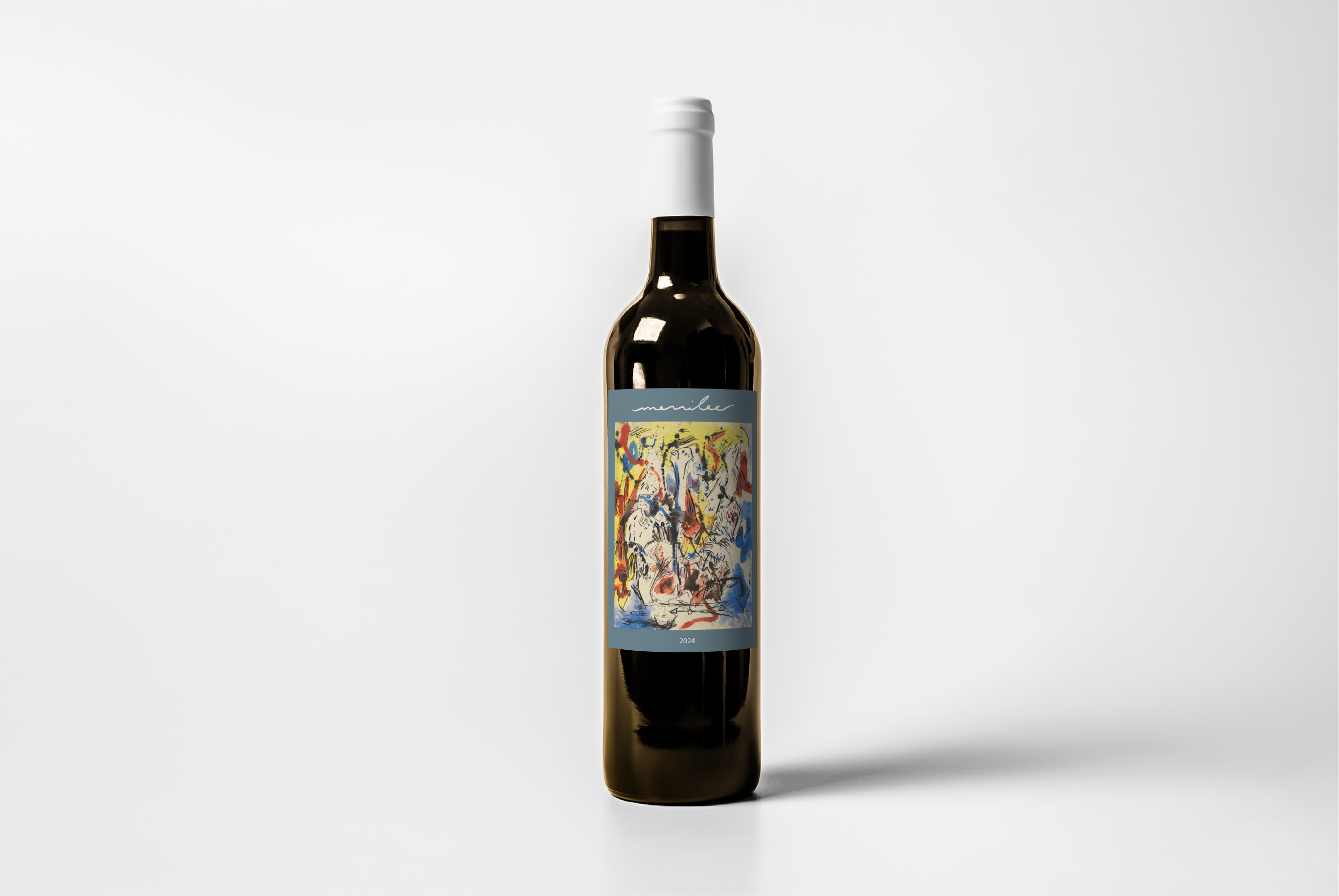
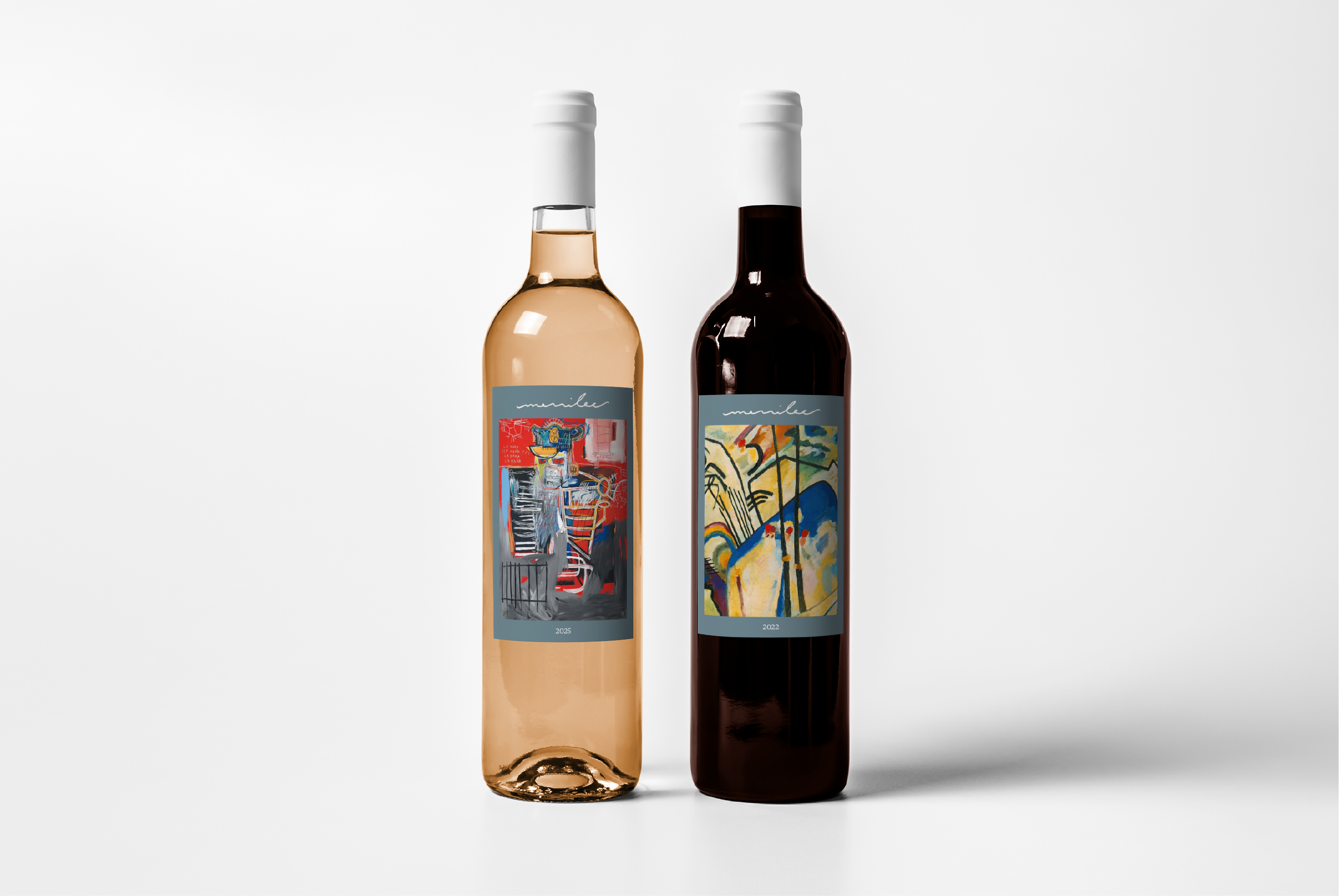
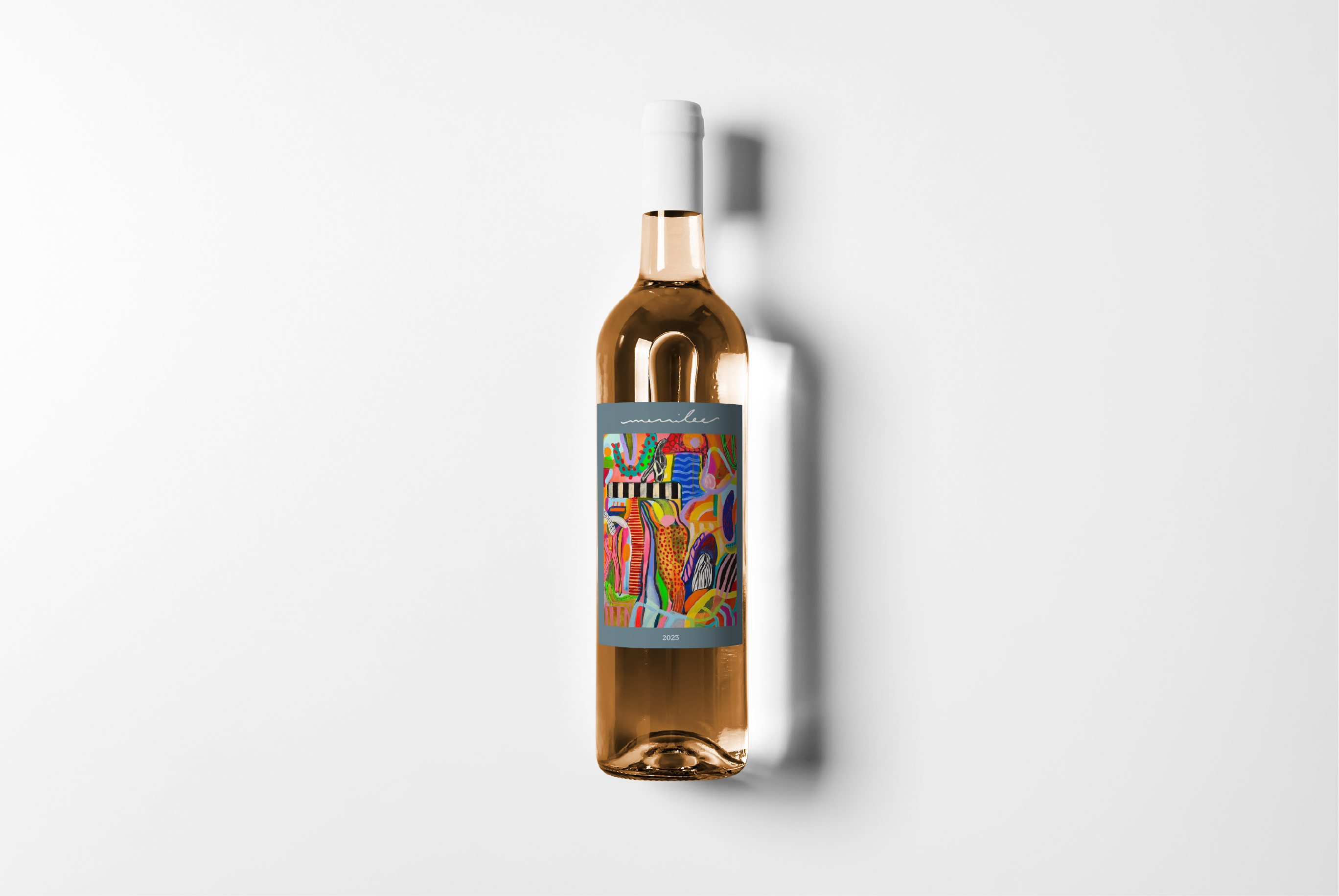
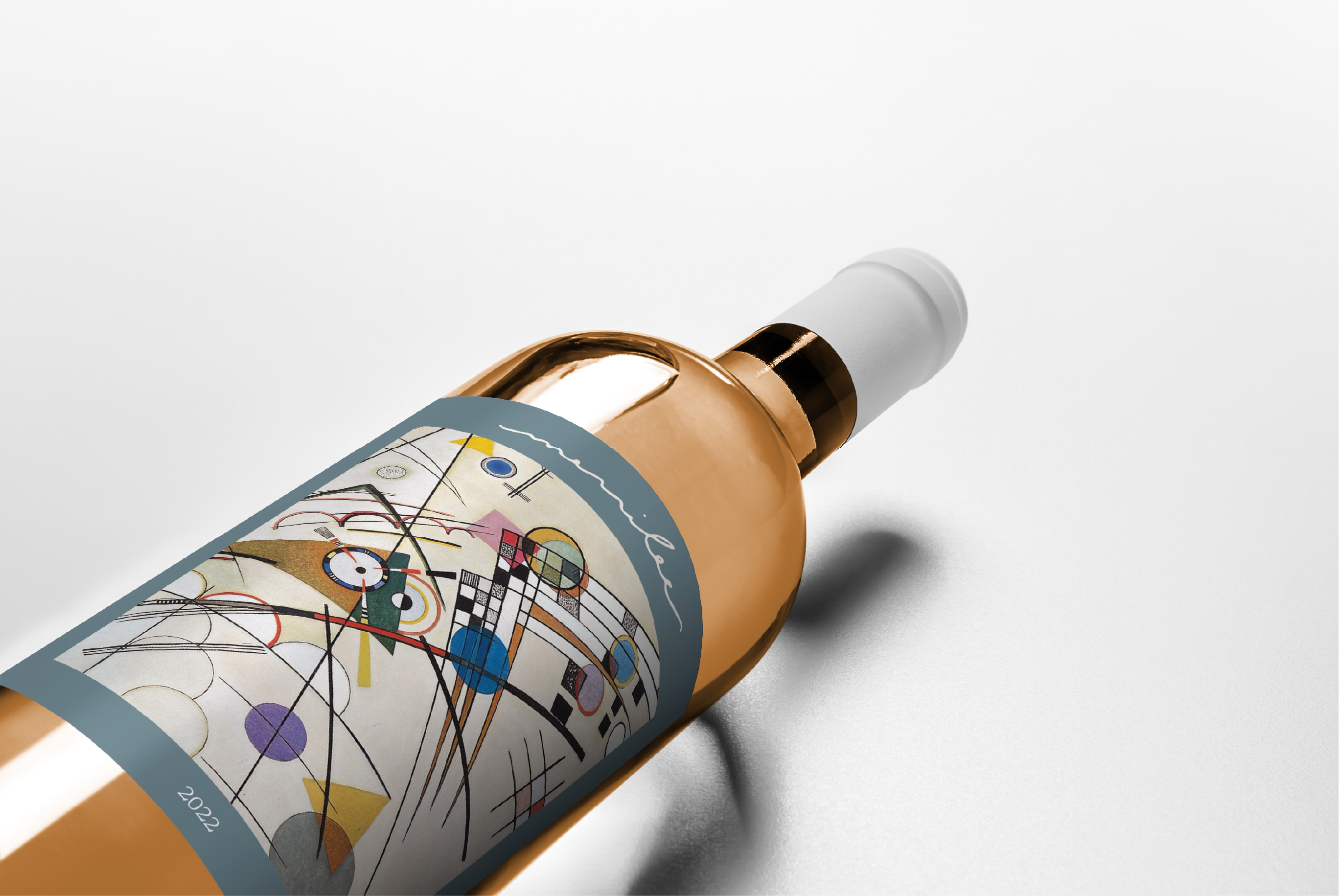
Merrilee came to us with an unusual challenge: they weren't just launching a wine shop — they were launching a new cultural idea. In a market saturated with rustic vineyard nostalgia and dark masculine cellar aesthetics, Merrilee wanted to do something genuinely different.

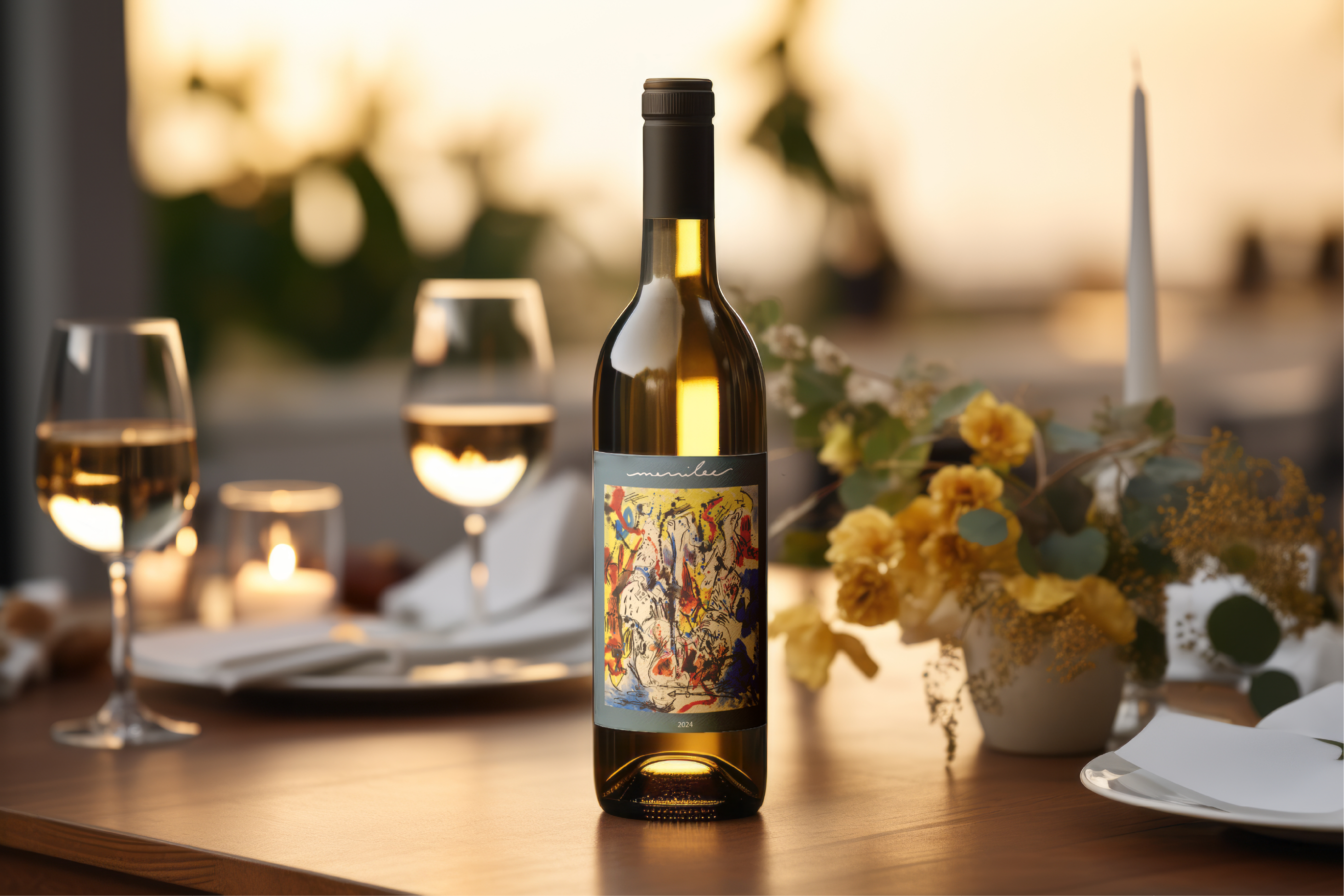
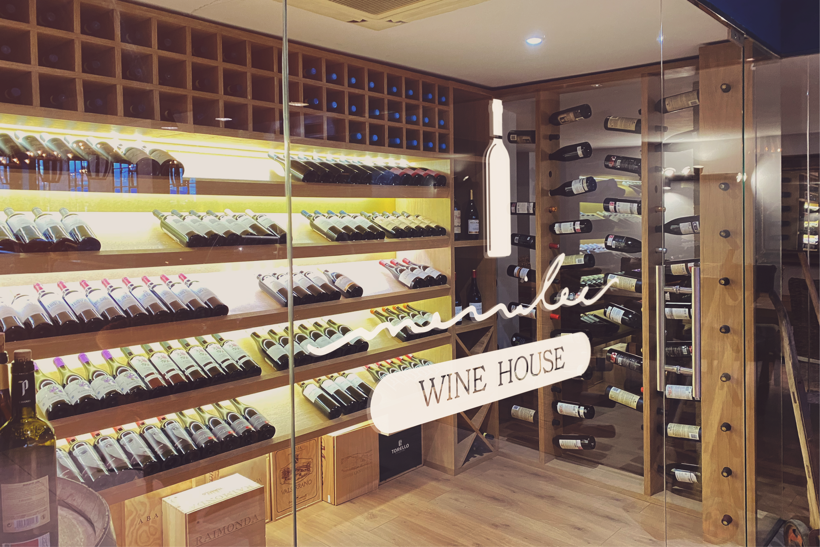
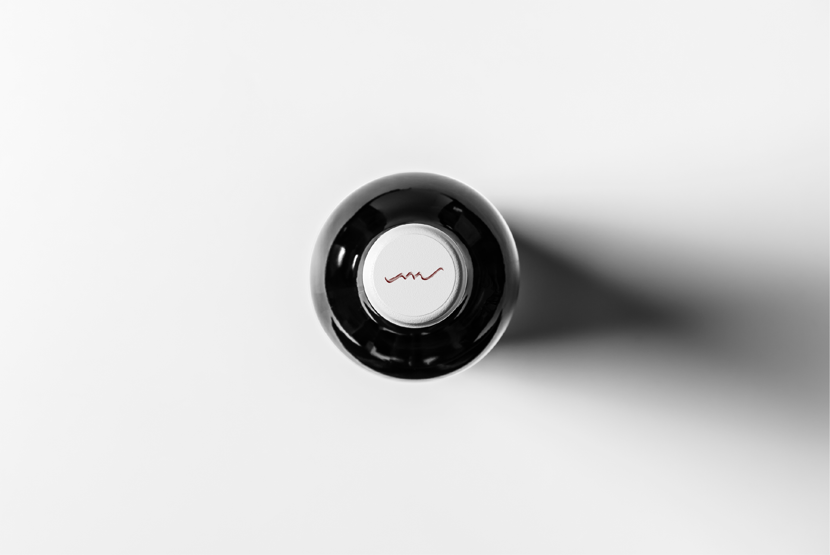
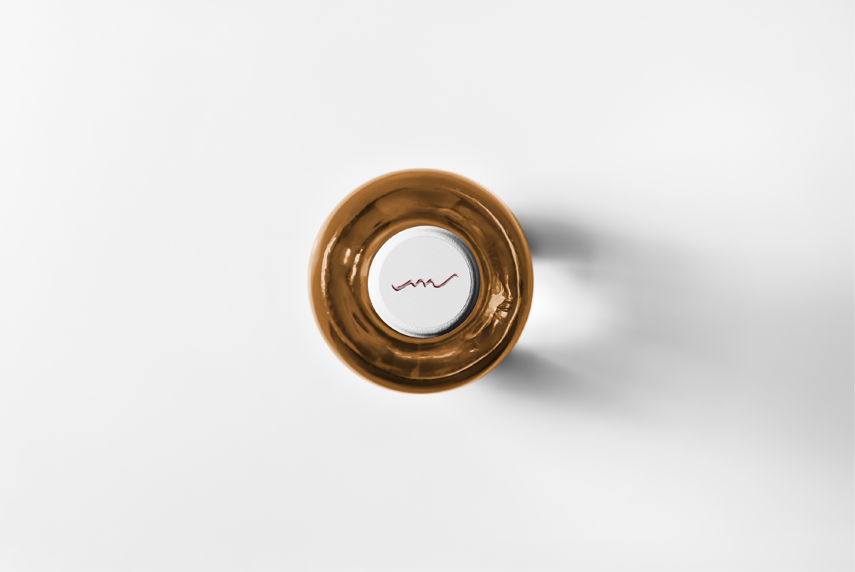
They wanted orange wine — complex, ancient, misunderstood — to feel accessible, artful, and alive. The brand needed to reflect the wine's character: unconventional, layered, worth discovering. And it needed to work at every scale, from a glass door logo to a bottle label to a cork top.

The core tension we had to resolve: how do you signal sophistication without exclusion? How do you honor the art and culture of winemaking while reaching an audience that's still learning?

"Orange wine is the most misunderstood wine in the world — we wanted our brand to be the one that explains it without ever condescending."
Merrilee Wine House physical location interior
Brand Identity

A signature
drawn in
motion.

The wordmark is the brand's soul: a fluid, hand-drawn script that moves like wine poured into glass. The trailing tail — extending beyond the final letter — suggests openness, generosity, and a story still being written. "WINE HOUSE" grounds it in a pill-shaped badge that intentionally contrasts the organic mark with structured restraint.

Merrilee logo on cream background
Merrilee logo on slate background
Merrilee logo on amber background
Color System
Linen
#EDE8DF
Slate
#627B86
Amber
#C07818
Charcoal
#1E1A15
Icon Mark — Four Expressions
Amber icon variant
Slate icon variant
Cream icon variant
Amber on cream icon variant

Every vintage,
a different
canvas.

The boldest decision we made: treat the label as a rotating art gallery. Each vintage year features an original work of art — abstract expressionism, contemporary painting, action art — behind a consistent slate frame that anchors the Merrilee script above and the year below. The result is a bottle that collectors return for, not just a wine they repurchase.

Merrilee 2024 red wine bottle
2024
Cabernet Franc
Two Merrilee bottles side by side
Merrilee 2023 orange wine bottle
Merrilee bottle closeup on copper
Details & Touchpoints

From
cork
to shelf.

Every touchpoint carries the mark. The cork cap disc — the last thing visible when a bottle is stored — carries the Merrilee initial script in a deep wine-red on crisp white. It's the detail that rewards attention: a reminder that this is a brand that cares about what happens even when nobody's watching.

Merrilee cork top from above — dark bottle
Merrilee copper bottle cork top
Merrilee Wine House lifestyle shot
↑40%
DTC Sales Post-Launch
12+
Retail Partners — Year One
1st
Art-Driven Orange Wine Brand

A brand that
ages well.

Ready to build something worth remembering? Let's start a conversation.

Start a Project →